Working with numerical data charts
All quantitative data in the View Analogue and dimensional data dashboard can be visualized as interactive histogram, box plot, or scatter plot charts.
Selected charts are displayed for you below the interactive map for each data type. You can also open a pop-up window with your preferred chart type by clicking the corresponding icon in the filter sidebar.
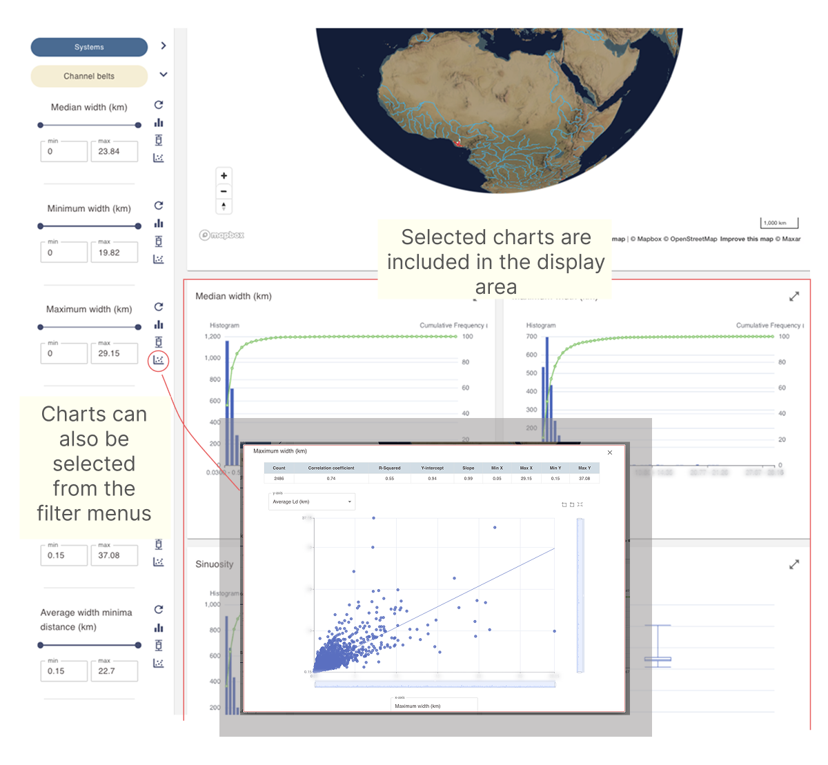
Accessing charts from the filter sidebar
Each filter containing numeric data allows you to display its data in histogram, box plot, or scatter plot charts.
The displayed data reflects the current filter selection, as well as all other active filters in the sidebar.
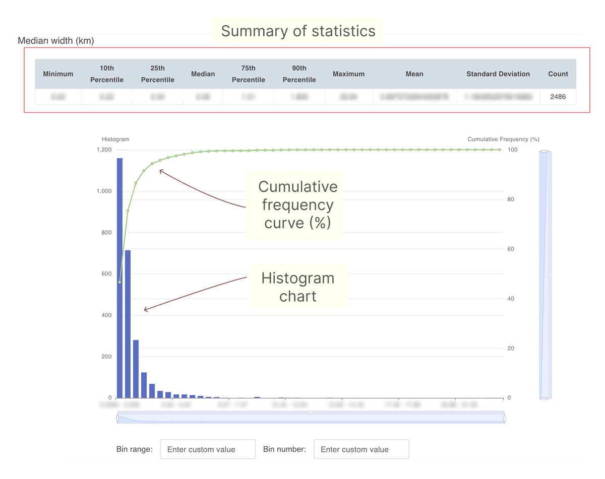
Using histogram charts
Histogram charts can be accessed either from the display area of the dashboard or by clicking the histogram icon next to numeric filters in the sidebar.
-
The plot provides a summary of key statistics for the parameter.
-
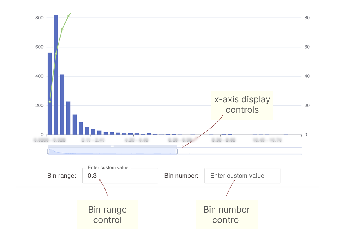
It allows you to interactively control the ranges on the x- and y-axes.
-
You can set your own bin range and bin number values.
-
A cumulative frequency curve is provided.
-
You can hover over any bar in the histogram to view its value.
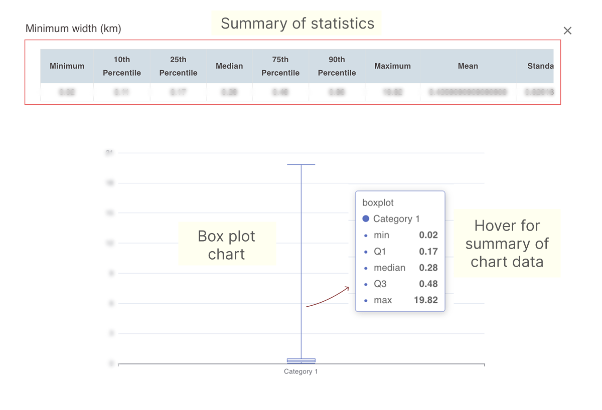
Using box plot charts
Box plot charts can be accessed either from the display area of the dashboard or by clicking the histogram icon next to numeric filters in the sidebar.
-
The plot provides a summary of key statistics for the parameter.
-
You can hover over the chart to view the statistics on which it is based.
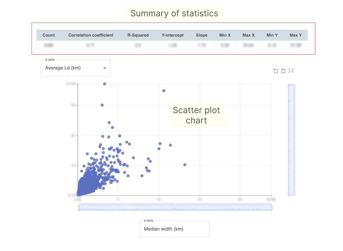
Using scatter plot charts
Scatter plot charts can be accessed either from the display area of the dashboard or by clicking the histogram icon next to numeric filters in the sidebar.
-
The plot provides a summary of key statistics for the parameter.
-
The filter parameter is shown on the x-axis.
-
You can use the drop-down menu on the y-axis to change cross-plot parameters.